
You are using an out of date browser. It may not display this or other websites correctly.
You should upgrade or use an alternative browser.
You should upgrade or use an alternative browser.
Whats the best looking paint scheme?
- Thread starter d_sinsley
- Start date
wheeler1963
Aurora & Portland Owner
Well you can likely guess my choice...
Union Pacific!!!?? hehehehe
P
Photogdad
Guest
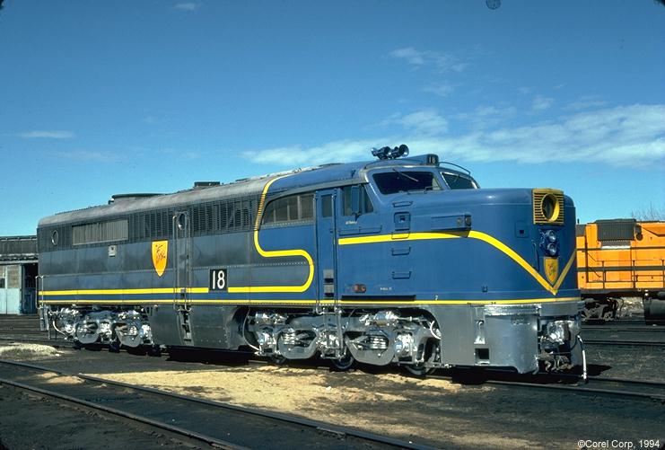
Even though its kinda plain and basic, I have found that the D&RGW paint scheme is neat.
Scordicus
Member
My semi-freelanced BH&W (Black top & ends with D&RGW stripes over primer grey (Pics to follow soonish when I finally get round to spraying the first GP9 lol))
D&RGW, NYC, NS (You following the black loco theme here!?! lol) followed closely by the SP faded grey lettering scheme...
D&RGW, NYC, NS (You following the black loco theme here!?! lol) followed closely by the SP faded grey lettering scheme...
Last edited by a moderator:
ho/ttothemoss
Member
union pacific american flag!
Littlefoot14
Active Member
Can't believe noones mentioned KCS Belle scheme yet? After that, I'd have to say DRGW, Alaska RR, CSX YN3, Delaware and Hudson lightening stripes, and CP Rail Golden Beaver scheme, UP 1995 and 1988.
As for the UP Flag Units, I love the concept, but I wish UP would clean them once in awhile, theres something about a dirty tattered up image of our flag that's just not okay.
As for the UP Flag Units, I love the concept, but I wish UP would clean them once in awhile, theres something about a dirty tattered up image of our flag that's just not okay.
ho/ttothemoss
Member
^ just means a hard working America!
Jeremiaha Austin
North to the Future
My Choice
wheeler1963
Aurora & Portland Owner
Is it just me or do others think that silver painted trucks as in post #17 always look hand painted and just awful?!? - they wouldn't look so bad I don't think if they were sprayed, but somehow it just never looks like they are.. (correct me if I'm wrong)...
I think part of it has to do with the trucks are cast iron, a very rough surface to start with.