
You are using an out of date browser. It may not display this or other websites correctly.
You should upgrade or use an alternative browser.
You should upgrade or use an alternative browser.
How do you make your pedestrian grade crossings?
- Thread starter Olie
- Start date
All of the examples look very good .. Luv that last one by KB02.
BOB .. Remember to clean the top of the rail off with a bright boy, or something similar - otherwise your electrical contact may not be good.
BOB .. Remember to clean the top of the rail off with a bright boy, or something similar - otherwise your electrical contact may not be good.
Last edited:
Now.....you tell me!
Yeah, well... I've never seen that done on the real thing. That doesn't mean somebody someplace hasn't done it. But it serves no good purpose on a full size train.
Also, you should have at least one plank on the outside of the rails. (I'd say "two" but the planks are wider than the real thing). Basically, the full width of the ties are covered with wood planks, including the outside.
All of the examples look very good .. Luv that last one by KB02.
BOB .. Remember to clean the top of the rail off with a bright boy, or something similar - otherwise your electrical contact may not be good.
They've got a machine for that...
Olie
Active Member
So, after some thinking and playing with strips of wood, here is what I have come up with. Pedestrian walkway is made from 1/16" basswood strips which is 10" scale and the grading is made from 3/32" basswood strip which is 15" scale. I was going to try slightly smaller strips but I didn't like the way they looked. The kit calls for card stock for the walkways and doesn't have anything for the gradings so I'm just going to make my own. I will be make the center grading rectangular at Bob's suggestion and the outside may get dropped to 2 strips instead of 3. I had already glued the 3 together and have to run to hobby lobby and pick up some more. Anyway, here's the pics.


Olie
Active Member
I am simply having fun building this model up. In the real world I might think differently but I'm not only enjoying myself but I'm learning new stuff as far as prototypical layouts. Plus, my wife loves the intricate details and we all know, if momma's happy, everybody's happy.I make my pedestrians walk across the tracks, sans crossing. I figure they're gonna do it anyway, why waste money on a crossing?
goscrewyourselves
I'm the one
Olie,
Great job!
Great job!
Olie
Active Member
Here is what I have come up with for my pedestrian grading on the back of the station. It is sitting on my metal work surface so I can hold things in place with the magnets so things will look uneven. I like the stained looked but I'm wondering if that works with the "stone" structure. Bob, I even squared off the ends and ramped them like you said! Anyway, thoughts?


Oh ya, forgot to mention, the roofing uprights I did in the Union Pacific yellow and red colors for some contrast. I'm on the fence with that color combination but the kit called for grey like the rest of the building and I'm getting tired of grey. Any ideas for colors or should I leave it yellow/red?
Oh ya, forgot to mention, the roofing uprights I did in the Union Pacific yellow and red colors for some contrast. I'm on the fence with that color combination but the kit called for grey like the rest of the building and I'm getting tired of grey. Any ideas for colors or should I leave it yellow/red?

I like the Yellow .. undecided on the red.
The wood is too stark looking -- might try some white or grey to tone it down, but I have to say that I like your work.
The wood is too stark looking -- might try some white or grey to tone it down, but I have to say that I like your work.
Olie
Active Member
I was thinking of "weathering" it a bit with some lighter colors, white and light grey. I tried some of the vinegar/steel wool weathering but there just isn't much tannin in the basswood so it doesn't react quite the same. I will be lighting this area as well so that should help. Thanks for the kind words, being my first time doing anything this small (N scale), I think it turned out pretty good. Wife says I'm too meticulous.I like the Yellow .. undecided on the red.
The wood is too stark looking -- might try some white or grey to tone it down, but I have to say that I like your work.
I like METICULOUS!
(That is the reason that my garage looks like the county landfill!)
(That is the reason that my garage looks like the county landfill!)
goscrewyourselves
I'm the one
Olie,
I like all that you have done, it looks great and the stain gives it a "regal" appearance. I know what you mean about everything being grey or tuscan oxide or similar, it does get boring and tends to cause everything to blend into one another after awhile.
Got to be honest here - red and yellow? Mmm not sure about that BUT as has been said, that could be toned down with some "meticulous weathering"")
Being meticulous should be the "norm", not the exception, in my opinion. Doing so shows that you (generally speaking) have pride in what it is you are doing and there is absolutely NOTHING wrong with that what so ever. My rule of thumb, which my wife hates by the way, is - if you are going to do something, do it properly, right and to the very best of your ability, anything else is half arsed and only letting yourself down.
I like all that you have done, it looks great and the stain gives it a "regal" appearance. I know what you mean about everything being grey or tuscan oxide or similar, it does get boring and tends to cause everything to blend into one another after awhile.
Got to be honest here - red and yellow? Mmm not sure about that BUT as has been said, that could be toned down with some "meticulous weathering"
Being meticulous should be the "norm", not the exception, in my opinion. Doing so shows that you (generally speaking) have pride in what it is you are doing and there is absolutely NOTHING wrong with that what so ever. My rule of thumb, which my wife hates by the way, is - if you are going to do something, do it properly, right and to the very best of your ability, anything else is half arsed and only letting yourself down.
Olie
Active Member
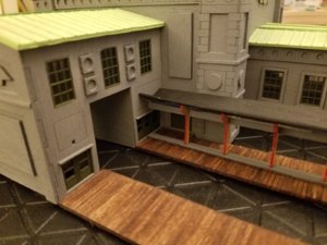
I figured I'd weather the building some and may give some of the trim pieces a slight color for contrast. The red and yellow were done on a whim. At first I didn't like it, especially the red. But......I completed the concourse and placed the platform floors and roof.(I don't like the roof over the platforms). When I look the posts now, not so bad. I just don't know what color to do. Here's a pic:Olie,
I like all that you have done, it looks great and the stain gives it a "regal" appearance. I know what you mean about everything being grey or tuscan oxide or similar, it does get boring and tends to cause everything to blend into one another after awhile.
Got to be honest here - red and yellow? Mmm not sure about that BUT as has been said, that could be toned down with some "meticulous weathering"
Being meticulous should be the "norm", not the exception, in my opinion. Doing so shows that you (generally speaking) have pride in what it is you are doing and there is absolutely NOTHING wrong with that what so ever. My rule of thumb, which my wife hates by the way, is - if you are going to do something, do it properly, right and to the very best of your ability, anything else is half arsed and only letting yourself down.
Attachments
goscrewyourselves
I'm the one
Olie,
The roof of the station is a green color, if it were me I'd carry through for all of the roofing associated with the station. The green looks good with the stained platform too and does offer contrast. Filing that go with black
The roof of the station is a green color, if it were me I'd carry through for all of the roofing associated with the station. The green looks good with the stained platform too and does offer contrast. Filing that go with black
Olie
Active Member
I wish the pictures would show better details but the roof is suppose to be aged copper, at least that what I think. So, instead of just painting it, I tried to simulate the copper in late stages of patina. Keeping that color would bring a more noticeable contrast to the platforms, thanks for the suggestion. The part I don't like is the V shape. Even the pictures the manufacturer has, the roof is flat. Just seems out of place with the size and "luxury" level of the station to have what looks like a bus station roof. So if I change it, should I stay with the copper roof theme or go to a different material?
goscrewyourselves
I'm the one
Just my thoughts here ... as for the roof I'd turn it upside down and have it as a gable keeping in line with the station roof and the station appearance.
Pictures show all the wrong things very clearly and, it seems, the things you want seen clearly never end up that way. I'm guessing that at the time the station would have been built copper rooves would have almost been the norm for such buildings so keeping it copper would/might be appropriate.
It could just be the current shape of the roof makes the copper look seem out of place. When you change that to how yo want the roof, take another look and it might seem to fit better. If it still looks odd, then maybe think about a different color?
The only thing I would change on the copper roof is to give it a few "streaks" of weathering. Currently it is too plain jane! I'll try and look at some pic from Union Station in LA. How is the roof on the platforms there, and what color are they? Get rid of the red - keep the yellow!
Olie
Active Member
I messed with it a little this morning and I flipped the roof section over. I think making them copper like the main building should make them fit in a little better. Just wish I had the card stock like the rest of the roofing sections.Just my thoughts here ... as for the roof I'd turn it upside down and have it as a gable keeping in line with the station roof and the station appearance.
Pictures show all the wrong things very clearly and, it seems, the things you want seen clearly never end up that way. I'm guessing that at the time the station would have been built copper rooves would have almost been the norm for such buildings so keeping it copper would/might be appropriate.
It could just be the current shape of the roof makes the copper look seem out of place. When you change that to how yo want the roof, take another look and it might seem to fit better. If it still looks odd, then maybe think about a different color?
I will try and take some better pics to show the "weathering" or patina effect I attempted to get. The current pics make it look like a single color. Unfortunately, copper, when severely weathered, has a pretty uniformed "green" or verdigris color. It does show when seeing the roof in person. Drop the red, that's two votes for that one!The only thing I would change on the copper roof is to give it a few "streaks" of weathering. Currently it is too plain jane! I'll try and look at some pic from Union Station in LA. How is the roof on the platforms there, and what color are they? Get rid of the red - keep the yellow!