You are using an out of date browser. It may not display this or other websites correctly.
You should upgrade or use an alternative browser.
You should upgrade or use an alternative browser.
Gaudy Paint Schemes..
- Thread starter BCK RR
- Start date
Iron Horseman
Well-Known Member
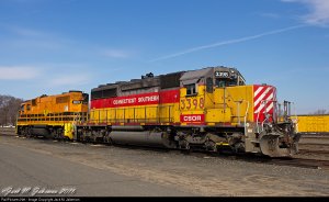
Seems they also had a lime green scheme but I can't find a photo of one.What does one think of when they or someone else sates thats a Gaudy paint scheme?
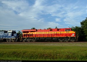
I don't know if it is gaudy but how about a technical eye sore...
Greg@mnrr
Section Hand
Forum:
Even though I don't model the BNSF, one of my first DCC locomotives was a BNSF loco like the one shown in Horseman's post. I like the paint job and still have the Atlas loco as one of my favorites. Brought it just because I liked the paint and color scheme. The base color of orange and the lettering looks great.
Runs great!
Thanks.
Greg
IronBeltKen
Lazy Daydreamer
As a diehard fan of the B&O during the 1968-1972 period - when they painted their locos dark blue with yellow trim - I lamented what I considered the "gaudy" Chessie System paint scheme when it first appeared in October 1972. Obviously many other modelers did not share my view, since Chessie has proven much more popular through the years.
Last edited by a moderator:
I admit to being a fan of bright color schemes (gaudy if you will), I'll even stick my neck out and say I really like UP's, I'm not a fan of black 'cause it disguises detail (I do ask myself why in that case I model mainly MRL, can anyone help). BNSF, I like the scheme with the large gold letters as shown in I.H's pic but prefer the Heritage2 with the dark green contrast rather than the black. Don't like the BN green or the Conrail blue though.
Iron Horseman
Well-Known Member
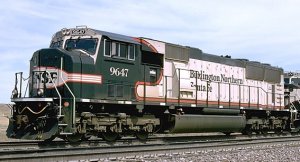
Agreed. Not gaudy, but kind of makes a horrific mockery of both the classic war bonnet and the distinguished executive schemes.I don't know if it's gaudy but I can't bear to look at this scheme!
SunsetLimited
Enjoy the Journey
I don't know if it's gaudy but I can't bear to look at this scheme!
Agreed. Not gaudy, but kind of makes a horrific mockery of both the classic war bonnet and the distinguished executive schemes.
It looks like its turned itself inside out or something!!
I'm gonna put in a bid for FGW's "Barbie" HST's:

Their "Dynamic Lines" livery was much more attactive.
Iron Horseman
Well-Known Member
I don't know if they did it on purpose or not but going to the black eliminated the eye sore (every one knows that technically an eye sore is a set of colors that fatigue a human's eye when looked at long enough, right?), so it became a Halloween scheme and then they went and added the wedgy logo to it. That logo would ruin any paint scheme.BNSF, I like the scheme with the large gold letters as shown in I.H's pic but prefer the Heritage2 with the dark green contrast rather than the black.
I never did either until it was gone. After they had been missing from common service for a while I saw one in a consist and suddenly understood its statement about the RRs geography and its elegance in simplicity.Don't like the BN green.
Actually I think all the different color schemes, gaudy or not, is one of the great attractions of US rail. Such a huge variety.
Iron Horseman
Well-Known Member
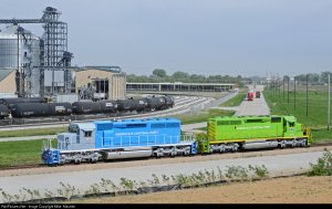
Where is "America's Central Port"?Here's my two cents.
Gaudy Paint Schemes?
Three words instantly come to mind... Chessie Steam Special
https://www.youtube.com/watch?v=Eu3wXUUNg2s
Three words instantly come to mind... Chessie Steam Special
https://www.youtube.com/watch?v=Eu3wXUUNg2s
Gaudy Paint Schemes?
Three words instantly come to mind... Chessie Steam Special
https://www.youtube.com/watch?v=Eu3wXUUNg2s
Yes.....but doesn't the yellow and red contrast well with the black smoke.........er.....paint.


